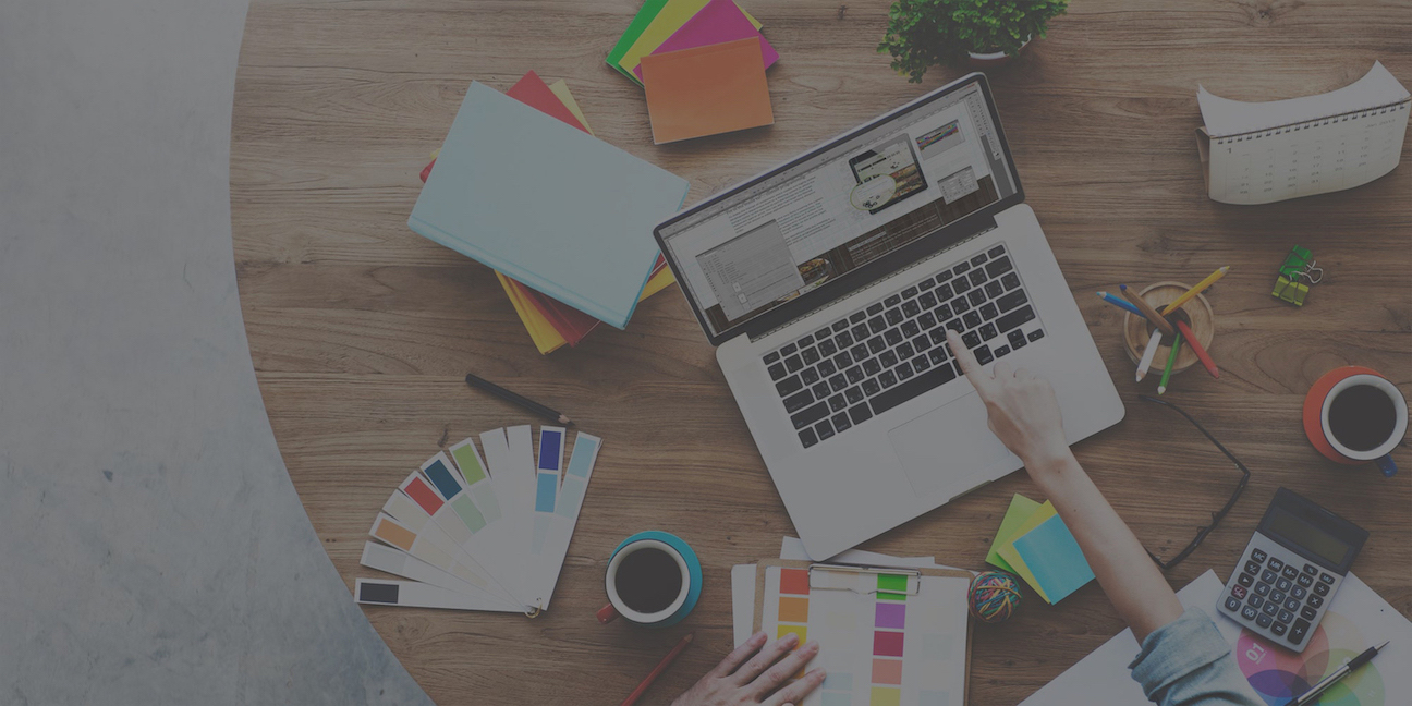
Logo Design Process
Clients often ask how the logo design process works.
We start with a meeting, in person or on the phone, to discuss your brand, your preferences and how the logo will be used. If you decide to move forward, I will send over a contract and 50% of the total is due via check or PayPal . Once that is complete, I take our discussion into account and design 3 concepts for review.
Then you review the logo design concepts and let me know which is your favorite design, what you like and dislike about the concepts and what else you would like to see in regards to colors, fonts, arrangement, etc.
With the original concepts and your feedback of them in mind, I make any updates or changes that we discuss, and possibly another version if I create something I think you will like. You then review this second set of logo designs and let me know which is your favorite design, what you like and dislike about the concepts and what else you would like to see in regards to colors, fonts, arrangement, etc.
I rework the second round of logos using your feedback as a guide and then present you the third and final round. From these options you choose your favorite as their new logo. Very rarely does anyone need further rounds of revisions, but if you do they will provided for an additional fee. Once the final payment of the remaining 50% is made (plus possibly the fee for any additional rounds of revisions), I send over your final files, including the master vector EPS file, PDF, 3 JEGs and 2 PNGs.
This entire process can take as few as 5 days, when the client likes one of the original designs and only has minor tweaks.
Ready to Get Started on your Logo Design?
Call Us: 727-743-8038
Email Us: Info@SpotlightGraphicDesign.com or fill out the form below:
Below is an example of the 3 rounds of logos I designed for my client Access Recycling and the progression until we came upon the final logo design.
At our first meeting the owner let me know that he wanted to use blues and greens and to integrate an arrow. After reviewing the first round he knew he liked 1B the best, but wanted to see a few other options for the integration of the arrow. After reviewing those, he liked 2B the best, but wanted to play around with which elements were which colors and also whether to use a gradient versus a solid color. 3B was the winner and is now Access Recycling Solution's new logo.


